

This was originally given as a talk at MDev 2026 on 11/06/26. A special thanks to Dekogon for the wonderful asset packs and demo scenes used to build this talk. The live version of this talk has slight variances from the script below.
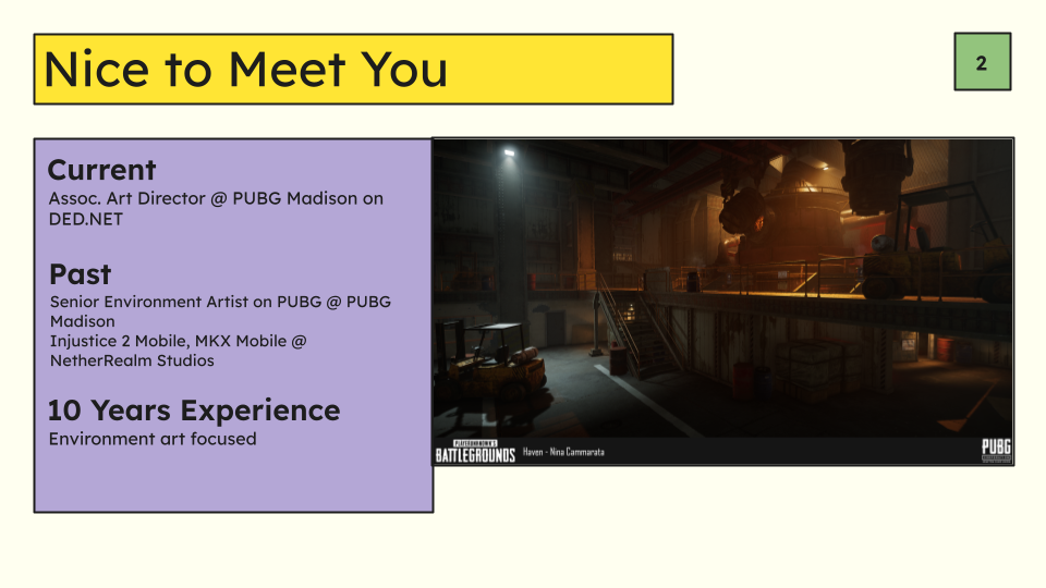
Hi everyone, my name is Nina Cammarata. I’ve been working in games for 10 years with most of my career being on multiplayer shooter titles. Currently I’m an associate art director at PUBG Madison working on DED.NET with a focus on Environments. Previously I spent many years working on PUBG and before that I spent some time at NetherRealm Studios working on Mortal Kombat X Mobile and Injustice 2 Mobile.
Today we’ll be talking about creating environment art that supports gameplay. What that means is how do you support the gameplay goals, communicate with the player, and how do you influence them to do what you want them to do without directly telling them.
This will largely be through the lens of 3D environment art but the many of the principles here are applicable to even 2D titles with a little interpretation.
We’ll start with a quick heart to heart:
Environment art and level design are two sides of the same coin. They go hand in hand.
Sometimes level designers and environment artists can feel at odds with each other. Level design wants something that the artist thinks makes the art worse, the environment artist has an idea that the level designer dismisses out of hand because they think it’ll never work for gameplay. This and a thousand other conflicts can arise out of a lack of understanding of the goals of your team mate. Its super easy to say “bah, they don’t know what they’re talking about”, or “they’re trying to ruin my art/design” and dismiss an idea or concern without understanding why the suggestion is being made.
Part of the deal here is understanding the motivations of others and negotiating with your teammate to find the solution that satisfies both parties even if it’s not the one that you initially suggested.
Remember a few things:
• You are on the same team, and you both want the same thing at the end of the day (to make a fun game that people want to play). It is in your best interests to get over whatever is preventing you from working as an equal and constructive team. I am talking to both the environment artists and the level designers in the room.
• You are most successful when you work together, and player can absolutely tell when you don’t.
• It does not matter how good the art of your game is if it is not fun. Players do not stick around to play games if they are not having fun. Can you remember a game where you thought “Oh that game was really pretty, I never finished it though. I didn’t like way X felt”. That is not to say all games that you don’t like are the fault of environment art, they are most certainly not, but you can absolutely contribute to that feeling. Am I saying the game has to be ugly for gameplay? No. You can have both if you work together.
You might think, “Of course! Why wouldn’t I work with the level designer/environment artist” but when the rubber hits the road you might surprised how much of a hurdle this can be for some. Many don’t even realize that this is what’s happening in their communications especially when little dissatisfying interactions add up over time.
Now that we have that out of the way we can get into it:
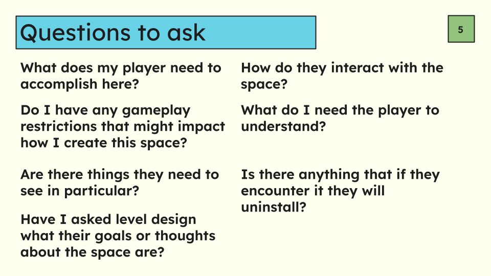
When approaching the environment art for your game its helpful to start with asking yourself or a level designer a few questions to establish your goals in terms of gameplay requirements.
What does my player need to accomplish here? Example: My player needs to find and kill as many other players as they can within a certain amount of time.
How do they need to interact with the space? My player runs, sprints, jumps, vaults, mantles, and loots supply crates.
Do I have any gameplay restrictions that might impact how I create this space? Spaces above a certain height from the ground must be inaccessible, you cannot hide in gaps around at ground level, traversal around the space must be smooth, cover must be a specific height tall, etc
What do I need the player to understand? They need to understand the flow of buildings intuitively, understand the location of supply crates, what is cover and what is not, when they are in cover and when they aren’t, where other players might be hiding, etc.
Are things they need to see in particular? They need to see players clearly, they need to see openings like windows and doors, they need to see supply crates,
Is there anything that if they encounter it they will uninstall the game? If they trip over an objects, or the environment in some way causes them to die in a way that is outside their control they will uninstall.
Have I asked level design what their goals or thoughts about the space are? Yes and they’ve told me that these specific things are important about the space, and these other things in the blockout are more flexible or they’ve said so whatever you want in those spaces.
There are so many more questions you could ask yourself or a level designer that are highly dependent on the game you are making but what is important here is that you are understanding what you need to make, why you need to make it, and how it fits into the game as a whole.
Once you’ve got some of the information you need we can start making some visual decisions:
Functional gameplay decisions for the purposes of this talk refer to decisions that are required to serve the gameplay but may not be characterized as particularly artistic. Despite that they are still extremely important. Let’s go over some examples here:
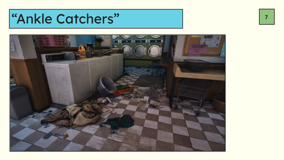
One of the biggest frustration points for players in any game where you navigate the world, but to an extra degree in multiplayer games is making sure that the collision is smooth and the player is not getting stuck on small objects by their feet. We often call these undesired bump of collision “ankle catchers”.
When player’s get caught on stuff like that their first, immediate, reaction is to become frustrated especially if it somehow causes them to die (or they think it caused them to die even if it didn’t). Personally, I’ve been killed by stuff like this even in single player RPGs and it upsets me every time. If it happens enough they might just stop playing your game.
Here in this screenshot I’ve made this deliberately hard to navigate.
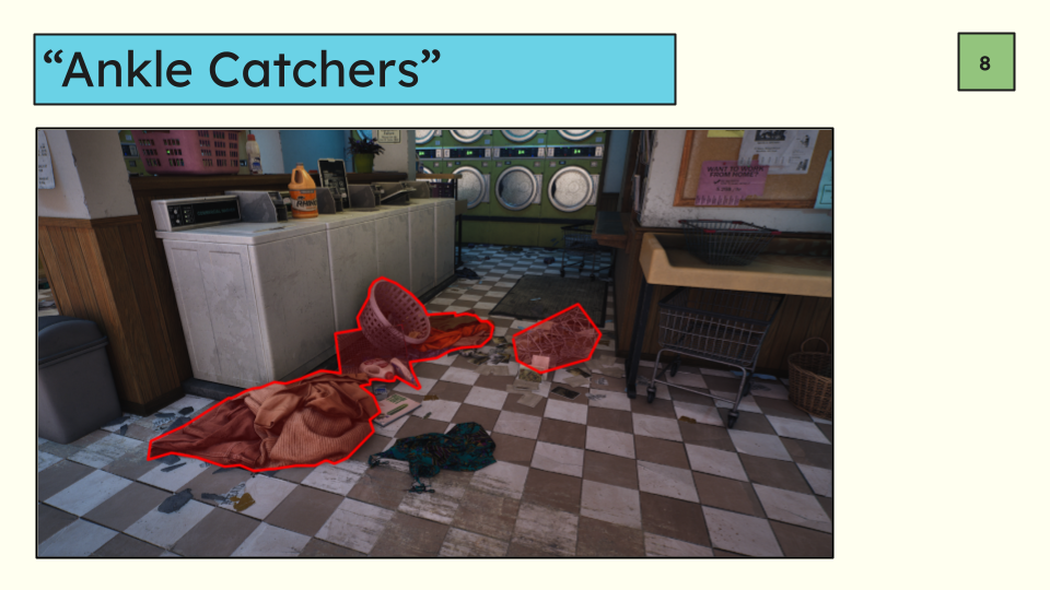
Medium objects are encroaching on the path and making the gap smaller and more difficult to navigate especially if you’re moving quickly through a space. In a multiplayer game this would be bad because you can get caught on them or it slows your movement as you step over.
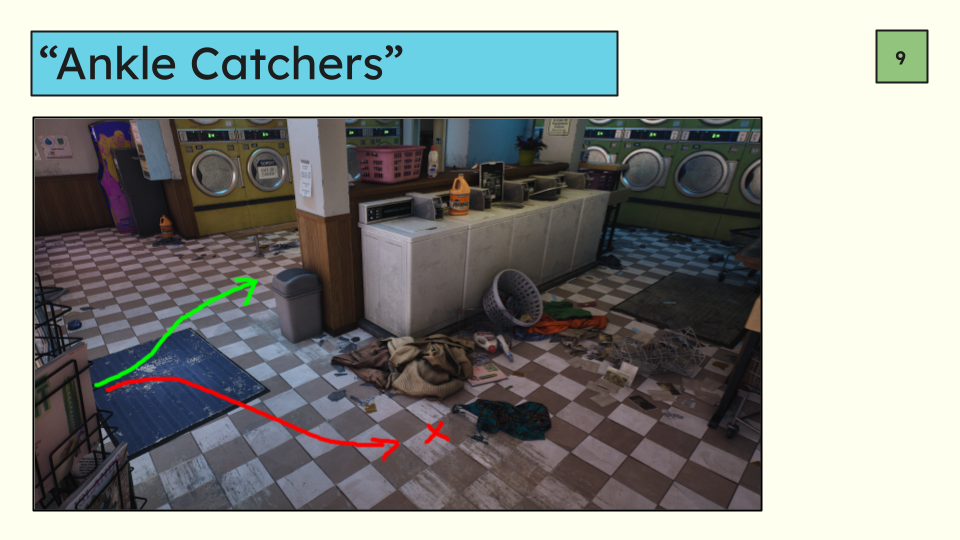
Even if something has no collision there is a psychological effect of it being “in the way” and breaking the mental flow of movement through the space. Like a “line in the sand”.
I could disable collision on most of these objects so the player passes right through them but even if I do there is a psychological barrier here that would influence a player to take the other, cleaner route.
Maybe that’s something you want to happen. If so you can leverage that psychological barrier to push the player where you want them to go, even if you are not literally forcing them.
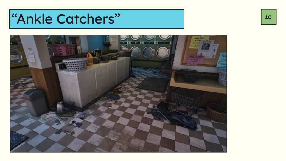
In general take a minute to think if that shallow pile of trash needs collision, or if it needs to be there at all.
Here I’ve made some adjustments from the perspective of a multiplayer game. Some objects have been moved, had their collision turned off and some things have been entirely deleted in favor of making smooth traversal.
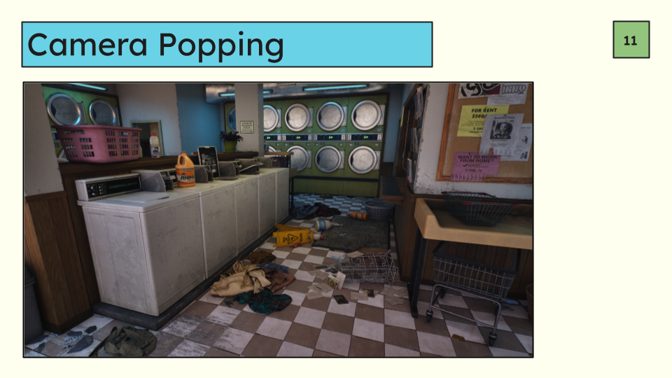
Another, softer version of this is anything that makes your camera do unexpected movements.
Does stepping up on a small step and back down cause you the camera to pop up and down? In a shooter that would be a problem because players are not looking at their feet so when something unexpected messes up their aim this is a big problem.
Consider not just the literal movement of the player capsule, but also the camera motion and how what you do affects it.
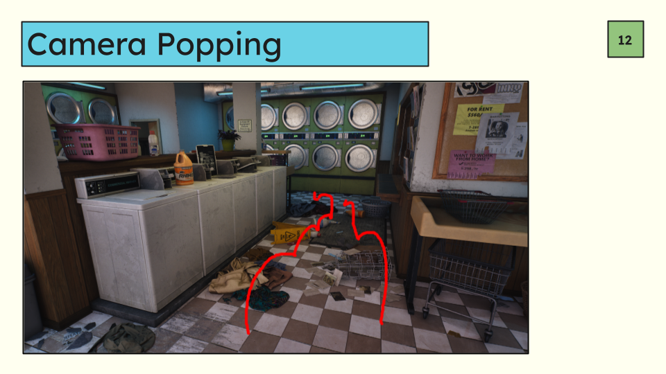
In this example you may be able to just run right over this depending on your locomotive system but it probably will make you camera bounce up and down which is likely undesirable.
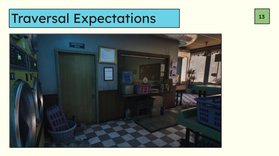
Next, how does the player need to move through the space? Is it obvious to them? Where can they jump, climb, or do whatever your game has them doing.
First we need to make it clear what we want them to do and then we also need to make sure that where it looks like you can do something you actually can. For example if we are wanting the player to vault, make sure they can.
Let’s take a look at this scene. We have taught the player at this point that you can open doors that look like this and that waist high windows are vault-able. At the moment the service window does not look vaultable, and the door is questionable. Maybe you can open it maybe you can’t. We need to make a decision here maybe with the help of our level designer friend. Do you want the window to be vaultable, and the door to be openable? Let’s say we want to vault the window because we have set the expectation you should be able to but block the door for some sort of game flow even though we have taught the player that doors that look like this are openable.
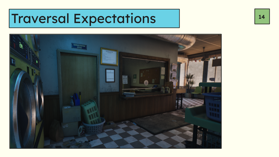
Here I’ve removed the blinds, all the stuff on the counter except a few things on the sides, and moved the chair that’s in the office away from the counter so there is a landing zone which should take care of making the counter look like you’ll vault over it (and the window will shatter in the process) and make it so you can successfully vault over it.
To communicate the door not being openable I have completely blocked it rather than having it hallway sorta blocked. Now it is clear that you are not meant to be able to go through that door even though it does exist in a world where doors are openable.
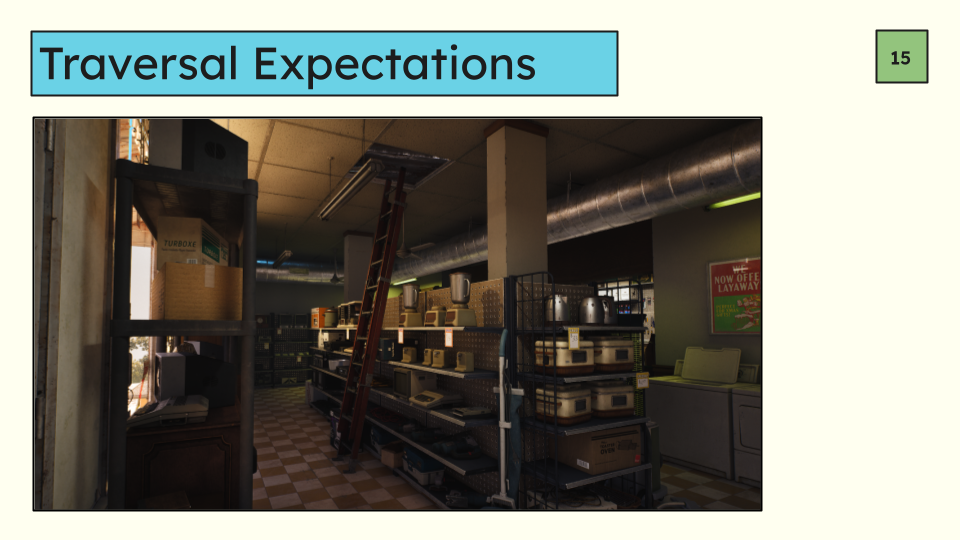
Another quick example here. This ladder looks like I should be able to climb it. Its red, in the middle of an aisle, and there’s a hole in the ceiling. If the game has taught me I can climb ladders I would absolutely try and climb this. If that’s what you want then mission accomplished but if not we need to change it.
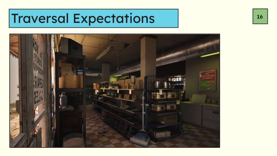
You can still keep the story, and with a small adjustment its more or less the same but you’ve removed the idea that it’s climbable from the player’s mind by just putting the ladder on the ground and closing the hole a bit so it’s not quite as open.
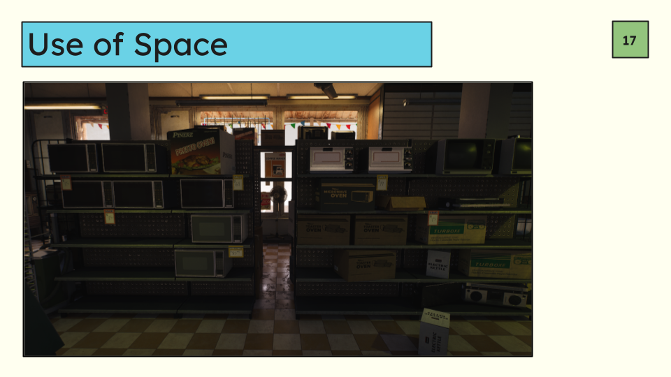
On a similar note it should be clear on how the player can move through the space. Can I go somewhere? Do I fit in a gap?
You need to make a decision about where you want the player to be and not to be. In this example there is a very narrow gap in the shelves. If the game has established that you can squeeze through cracks, and they can do it here then it’s probably fine. If they cannot squeeze the character capsule probably won’t fit which a player will find frustrating because it looks like you should be able to.
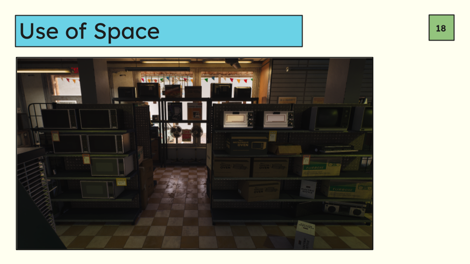
To fix that you’d either need to make the hole bigger.
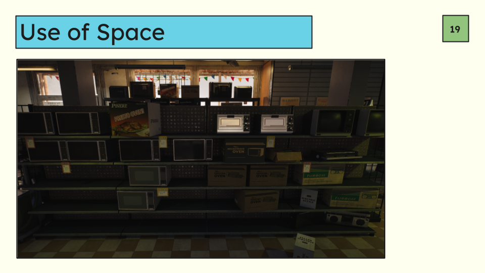
Or smaller.
But either way make it clear.
This all comes down to expectations and intent. If you have established that a game is linear and there is no reason to veer off the golden path then you get a lot more leeway on concepts like these because of the expectation that there is one main path already and the player knows that because you’ve told them there is nowhere to explore.
But if you have an open game where you can go to some degree anywhere you have to think a lot more about how you want them to interact with your environment in very specific terms.
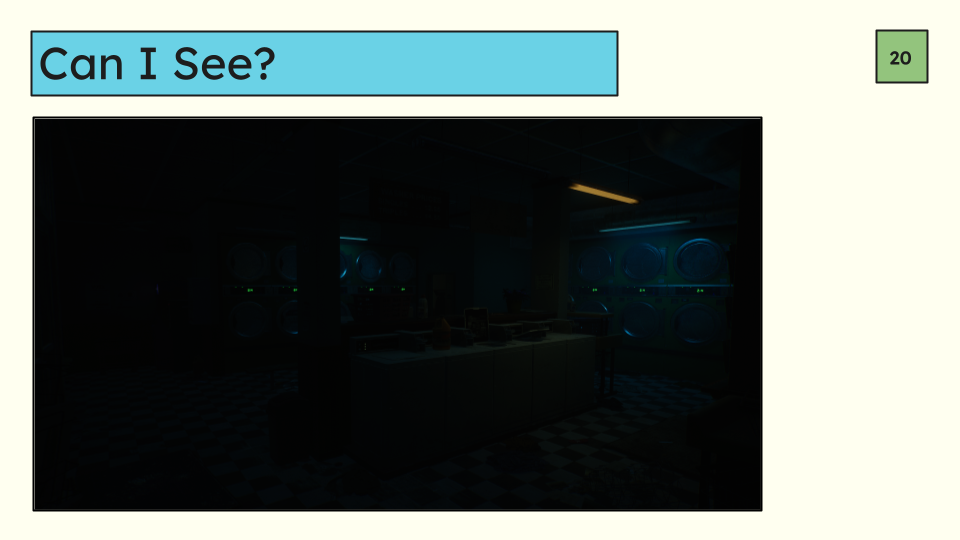
Another big one is do I have the ability to see where I’m going? Is the level literally too dark for the required gameplay?
As artists we love drama and contrast and can sometimes gravitate towards having super dark shadows because it looks good and moody. But ever played a game where you adjusted your gamma to be as recommended by the game and then still cannot see where you are going sometimes? Pretty frustrating right?
How much light you need definitely varies quite a bit depending on the game. If you have flashlights, torches, or other methods of lighting up dark corners and that is a part of your gameplay then darkness might be acceptable. Or if its a horror game you might want it to be dark and that is by design.
The key here is making a deliberate choice about how a scene looks based on the design rather than what simply looks good and coming up with effective solutions that meet your gameplay and visual needs.
There are a lot more functional gameplay accommodations you might need to make based on the game you are making, this is just a very very small sample of common ones I see in the games I’ve worked on and in the games that I play.
At the end of the day it comes down to making sure expectations are clear to the player, and that the player’s expectations that you have established for them are met.
Gameplay accommodations that can be characterized as visual communication are often much more artistic and lean on artistic decisions rather than strictly level design decisions. This is where you likely have much more freedom that in the functional gameplay category.
Here we are trying to tell the player something is important, or isn’t important, and they should pay attention. This could be where they need to go, where the next boss is, that there is a trap nearby, where nearby players might be spotted, what you can interact with, etc.
Something you’ve absolutely seen a lot in games is the white or yellow paint, blue tarps, etc. These are an example for what I mean here by visual communication. They are telling the player where to go, that they can do something, albeit a bit heavy handed. These more obvious markers are a solution but we can also leverage our fundamental art skills to do this as well especially in space where you have multiple priorities. Value, color, saturation, noise, etc.
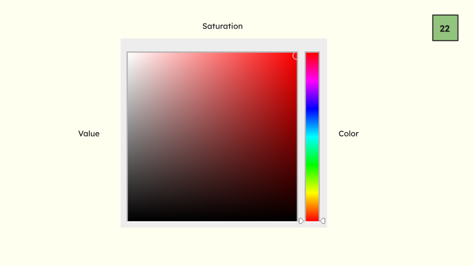
I’m sure you all know what I mean when I use these terms but here is a quick review of what I’m talking about when I use the terms value, color, and saturation:
Value refers to how light or dark a pixel is.
Color refers to which color it is, red, blue, etc.
Saturation refers to how intense a particular color is.
We’ll be using all three terms as separate entities in the next section.
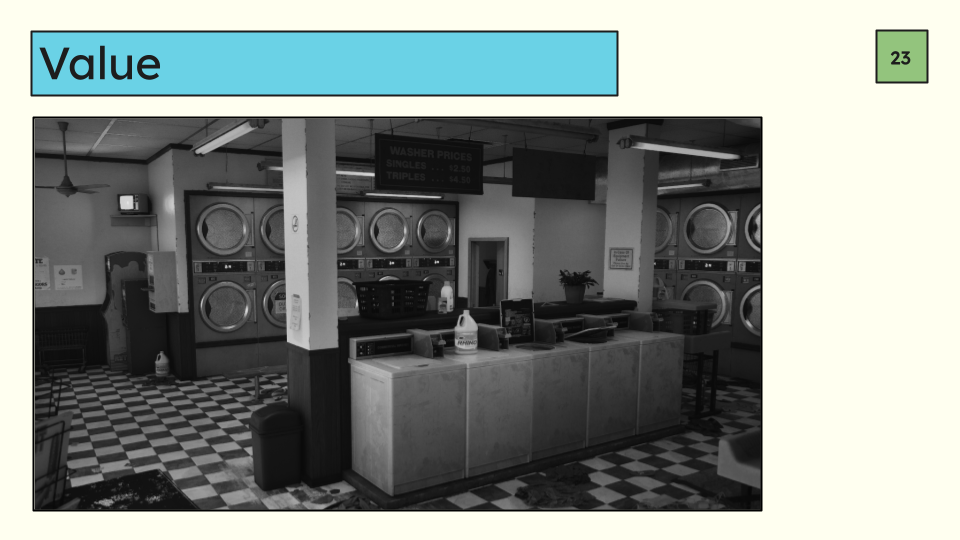
When trying to communicate something to the player the first level we can pull is value. Value is one of the biggest drivers of what we look at and what we gloss over.
If something stands out from the rest of the scene in value that is likely what we notice. If the scene has no groupings of value and its a bit all over the place the scene will be hard to look at because it becomes overly noisy.
A trick to check this value is to turn on the greyscale screen filter and attach it to a hotkey so you can toggle it on and off while you work. I use it constantly when reviewing work in my day to day.
For 3D environment art we can evaluate greyscale in two ways—lit and unlit modes. Lit allows you to see the values including how they’re affected by lighting. And unlit allows you to work locally.
We often think of lit value and local value as separate ideas because if you are communicating adequately in unlit with no lighting at all that means your message will be well on its way to being successful in any lighting, and when you change that lighting (for time of day for example) the scene won’t suddenly look “wrong” like it might if you tweak material level value with the lights on. It also helps you compartmentalize what you are working on so you can be very specific about what you are changing and why. We’ll be working in unlit mode for this section.
Take a look at this first example. Its in greyscale because we are currently only talking about value. Here your eye bounces around the scene—the bleach bottles in the front, super bright lights, the second washer in the front, the high contrast check on the floor, the dark strip on the washing machine, the trash can, washer price signs. Everyone will notice different things but what you will most likely see are the darkest and the brightest objects in the scene first.
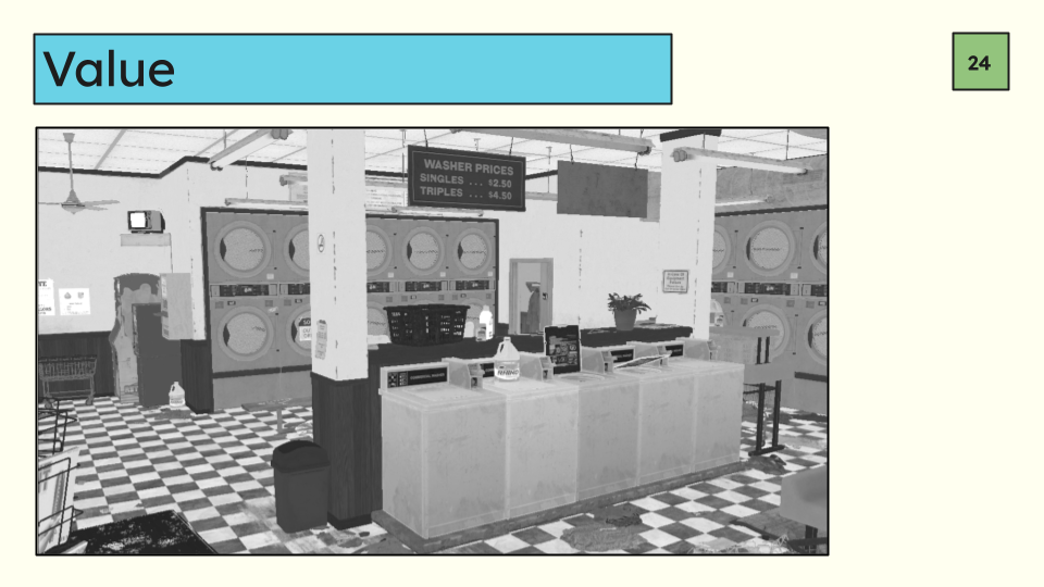
Let’s switch it to unlit mode.
Most of the objects I just mentioned fall into the categories of brightest and darkest. With the super bright walls and very high contrast floor this image becomes hard to look at and discern what is important and what isn’t. Are those bleach bottles important? The second washer in the middle bank because it’s slightly brighter? The black wash basket? The signs above the washer? And so on. The scene vibrates to some degree because of the super high range of value without much focus.
Before we talk solutions let’s look at another example that goes in the opposite direction.
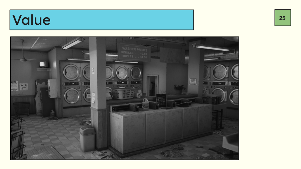
This version of the scene is equally hard to read just in a different way. Objects and surfaces start to blend together. What do we see first? Most likely the TV, lights, accents on the washers, and some of the signs posted on the walls.
Why? Because they are the brightest and darkest values. Your eye is searching for information to help you discern what something is and if it’s important.
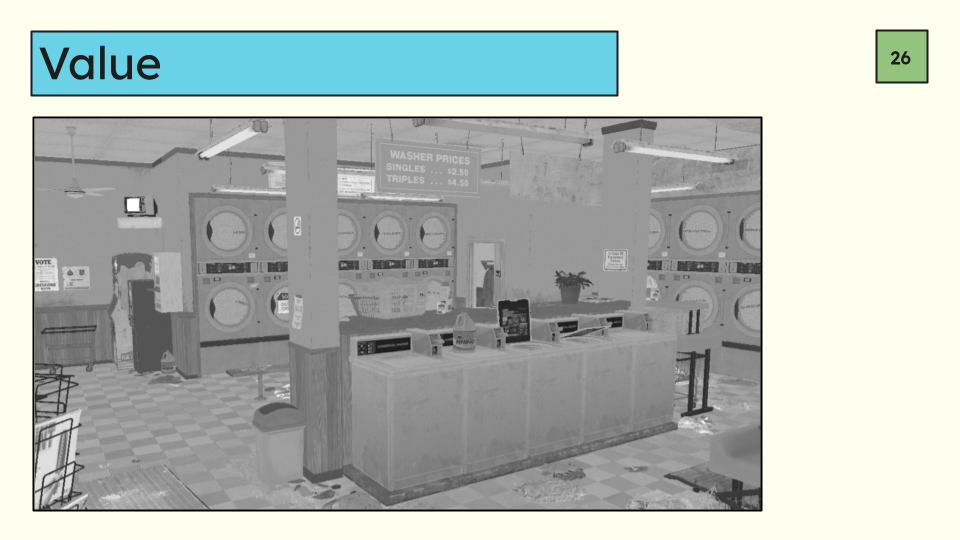
If we put this into unlit mode and take away lighting information it becomes even vaguer.
Those same items I just listed stand out, again because they are the outliers in a very homogenous scene. In a value structure like this you’ll see players start to bump into walls more, and start tripping on objects in the world more because their eyes will simply glaze right over them. Like the bench in the back that merges right into the floor.
In a low-light scenario where there aren’t a lot of distinct shadows this issue would be exacerbated because we are being forced to rely on shadow information alone to figure out what’s what.
Now let’s fix it.
Let’s say we’re working on a game where you’ve been narratively tasked with finding an object an NPC lost and it’s somewhere in the laundromat. This puzzle isn’t supposed to be a super hard solve but we do need to to take a hot second so that the main character can talk to themselves a little bit. We’re going to do this ONLY with value. There are other levers we can pull to supplement but we’ll get to those later.
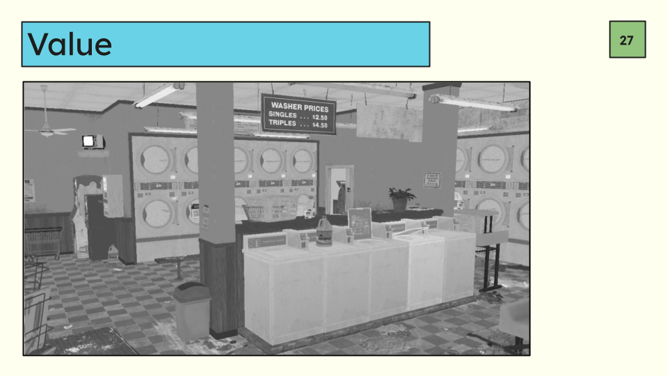
A few key changes here: First, the walls, floors, and ceiling are all different values even if the difference is slight. This helps the player map the bounds of the space.
The white walls are pushed back to allow all the banks of washing machines to come forward in the image, because the hidden object is in one of these washers.
Bright objects like some of the signage and paper taped to the walls has been tamped down because it’s not important, and then I’ve given the washer that does contain the narrative object a slight boost. Once you flip this into lit mode that difference is even more subtle, but players can unconsciously discern the difference and it will influence their decisions without them even knowing.
Of course we could skip all this and put a big outline around the washer but then this is too easy and we’ve removed the player’s path to discovery. There’s no one correct solution here, it entirely depends on your goal and what’s important to your gameplay.
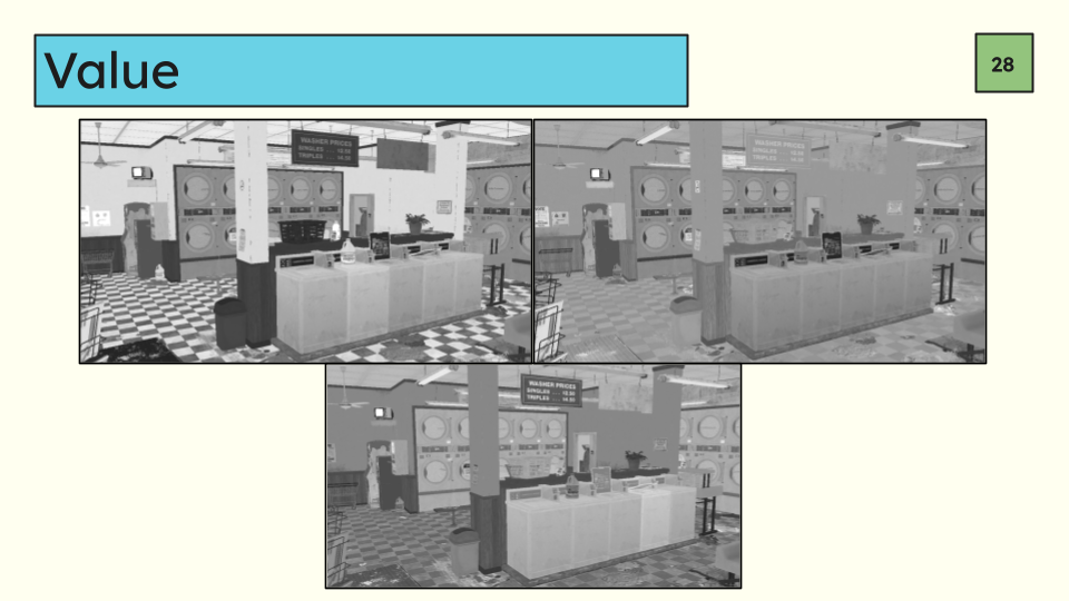
A quick comparison of all three unlit modes so you can see the side by side differences. Super high contrast, super low contrast, and a middle ground done with specific intent.
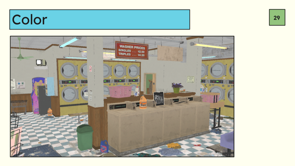
Let’s move onto the next aspect: color.
All the previous examples were done with no color at all because that can also influence what you look at.
We’re still, like before, going to be looking at a lot of unlit modes so that we can see the local color without lighting influence because lighting influence is huge.
In this example we have lots of colors all over the place. Green, pink, blue, yellow, red, and so on. The use of color draws attention to the objects that are using them which may not be of import to the player. The green fan for example is almost certainly not important. The blue and orange cleaning bottles may be important but there is a very high chance they’re not in whatever game you’re making unless one of the mechanics requires you to pick up these bottles. It’s also simply harder to look at. Like the value example your eye bounces all over the image trying to process the noise.
What can we do to help the player pick out what’s important? We can pick a few colors to focus on for the scene at large, and then use our gameplay knowledge to highlight what the player should care about with color.
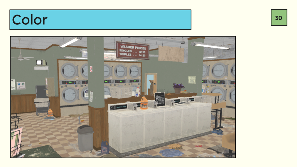
In the updated version you have been tasked by your uncle to fetch 5 bleach bottles he lost around the store.
We’ve done a few things to help the player achieve this gameplay goal. Most colors were shifted to a warm yellow/green palette so that its a bit easier on the eyes overall because there is less color noise, but also so that we can utilize other colors to make those bottles stand out more than the rest of the scene. That doesn’t mean every color is shifted to the palette, but we don’t have any strong outliers. Outliers to the palette have been desaturated so they stick out less.
Some objects have been deleted. If there are some objects that just don’t fit in, like the colorful arcade cabinet in the back its ok to delete them if it doesn’t support the gameplay goals here. In this case it stood out both because of how bright it was and the colors didn’t fit the main scene palette even when desaturated. Because all the colors are now more limited the bleach bottles are much more visible and are the most important thing in the scene.
You can also use color to separate spaces, like I’ve done here by making the hallway in the distance blue. Its a good way to make doors more clear and visible by creating color contrast beyond them.
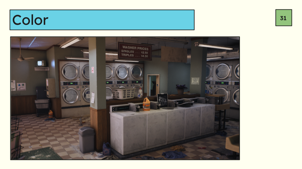
A note on saturation—saturation alone can make something stand out or not stand out so its good to be aware of your average levels of saturation and monitor outliers especially if it doesn’t fit into your primary palette.
For example there is a blue cleaner bottle in the front of the image, and if I increase the saturation back to what it was originally—
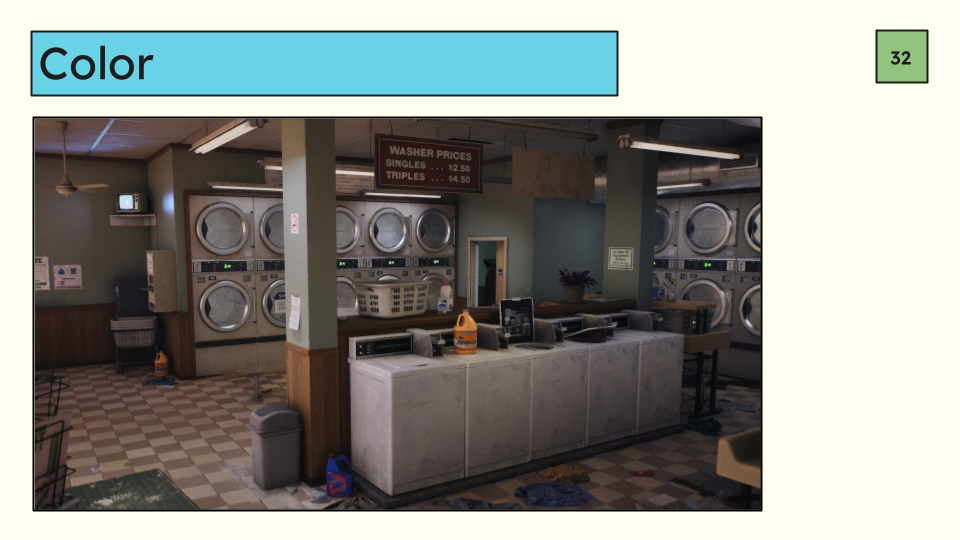
It now stands out despite the color not having changed at all.
To be clear all this is not to say saturation is bad in general. You can have very saturated games that use these same principles as its all relative. Stylized games in particular often leverage a higher average chroma but still use similar principles of relativity to direct attention.
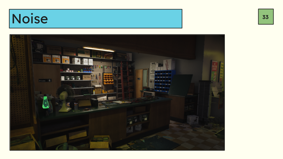
Next we have the use of noise. Noise can be created by basically anything, color, value, etc. But here we’re mostly going to be talking about set dress noise and the number of perceived objects in your scene. Lots of trash, clutter, and misc background objects can make a scene hard to parse because there is a lot to take in and understand.
Modulating the value and the color as we already talked about can help make a densely set dressed space less noisy but object density still can increase the mental load on your player. For some games this isn’t a huge deal as long as you’re not tripping over everything in the scene because the gameplay has the mental space for denser set dress. An example of that might be a slow paced narrative game. For multiplayer games like the ones I’ve spent most of my career on this is critically important to keep tabs on. When you are scanning every pixel for an enemy, parsing through 100 tchotchkes on a shelf will get tiring fast which will lead to player fatigue.
Let’s look at this scene for example:
There is a lot of stuff here. Like a lot a lot. For some games this might be ok, it’s not inherently wrong. If you are working on purely narrative game and the goal is to physically represent the chaotic mind of the store owner then this might work. But it is an overload for the eyes. What if we were making a multiplayer shooter?
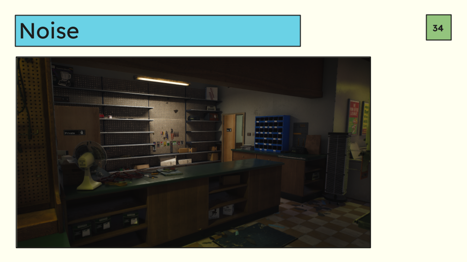
This might be more what you’re looking for:
The mesh noise is dramatically reduced which makes this scene either to parse when moving and looking quickly. Is it less interesting? Yes, probably, but it gets the point across. Messy electronic store. I’ve also done a few other things for gameplay here like clearing counter tops so that you can jump over them cleanly, clearing out clutter around head height, and squaring up sightlines like the folding counter so that there are no little peek-a-boo sliver shots that you can get shot through.
And also picked up objects off the floor so that the running path is smooth and clear enough that you won’t get tripped up on something while ADSing. In a shooter the environment is there to support the gameplay, not to be a masterwork on its own at the sacrifice of readability. To be honest, you could go even less here, and you may have to for performance reasons.
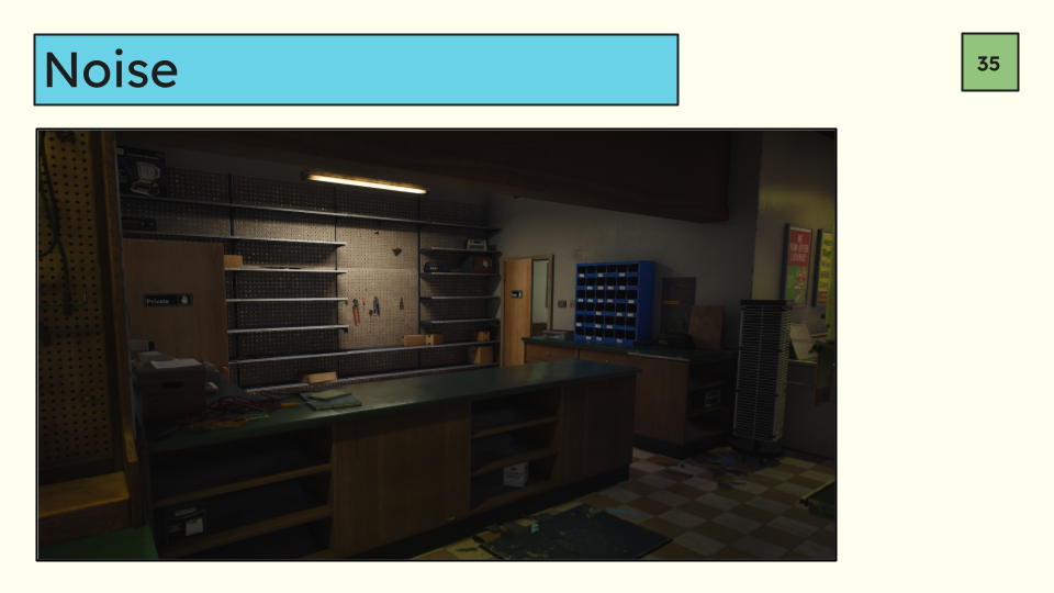
One more pass:
This time I mostly stripped out small objects which further reduced the noise and increased readability. Even in multiplayer games there is a balance to strike here between how much volume of art a scene can take between gameplay, the desire to make it as detailed and beautiful as possible, and really, performance.
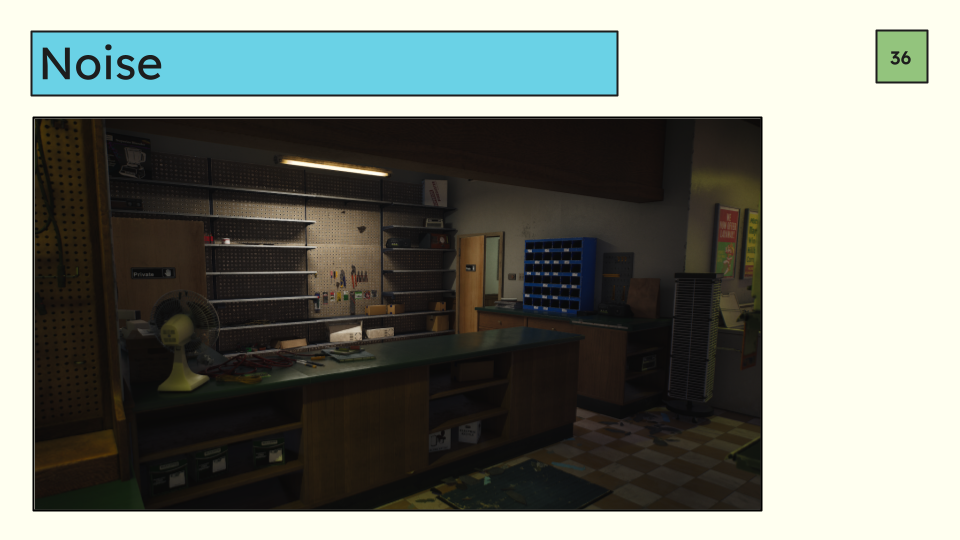
We can also use noise to focus attention. Say we can’t really have tons of noise, but we can have some. We should use that resource we have to call attention to what’s important. Let’s go back to our middle level detail multiplayer example. In this hypothetical shooter you can loot objects to find meds and ammo. We need to get players to see a lootable object that’s not currently there is this version of the scene.
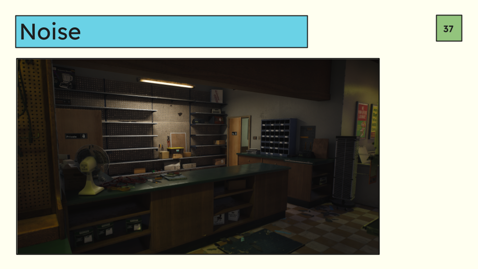
So making a couple quick edits: Along the back wall I’ve taken the noise available like the tools and boxes and focused it primarily around the yellow top container lootable object. I’ve also deleted some some objects elsewhere on the wall that pull focus away from the center. We can also use value and color like before to help us out. I reduced the saturation of the screw cabinet and lowered the value of the white boxes to allow the yellow top container to become the focus. Its fortunate that we have this light here in the middle to help us out as well because it really makes it super obvious what we should be looking at. Its right under the light.
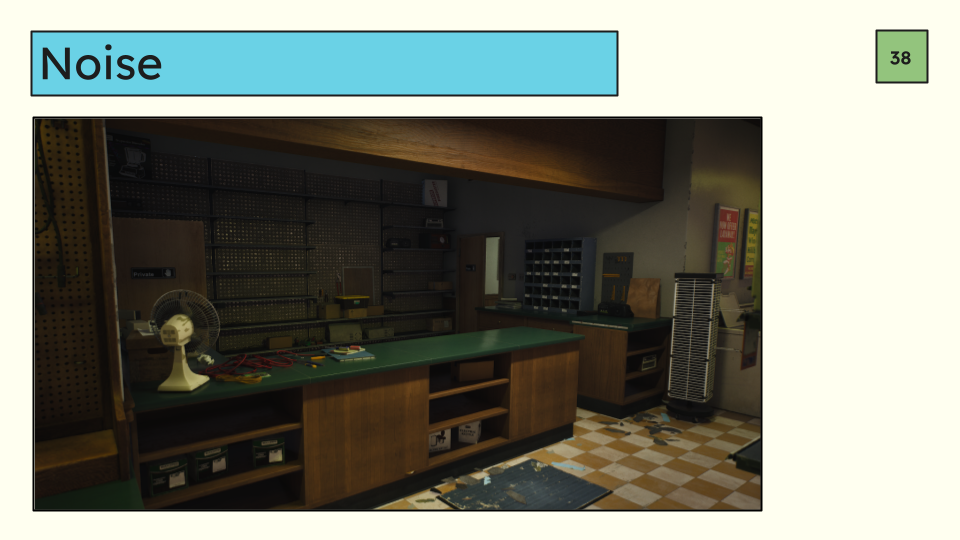
If we move the light so that it isn’t helping us out quite as much we can still zero in on the loot container because of the color of the lid but also the noise that surrounds the loot box in question.
Speaking of lighting, we’ve arrived at our last concept for today. Lighting is such a big topic it could be its own talk but we’re going to focus on a few quick tips on how to leverage it for gameplay.
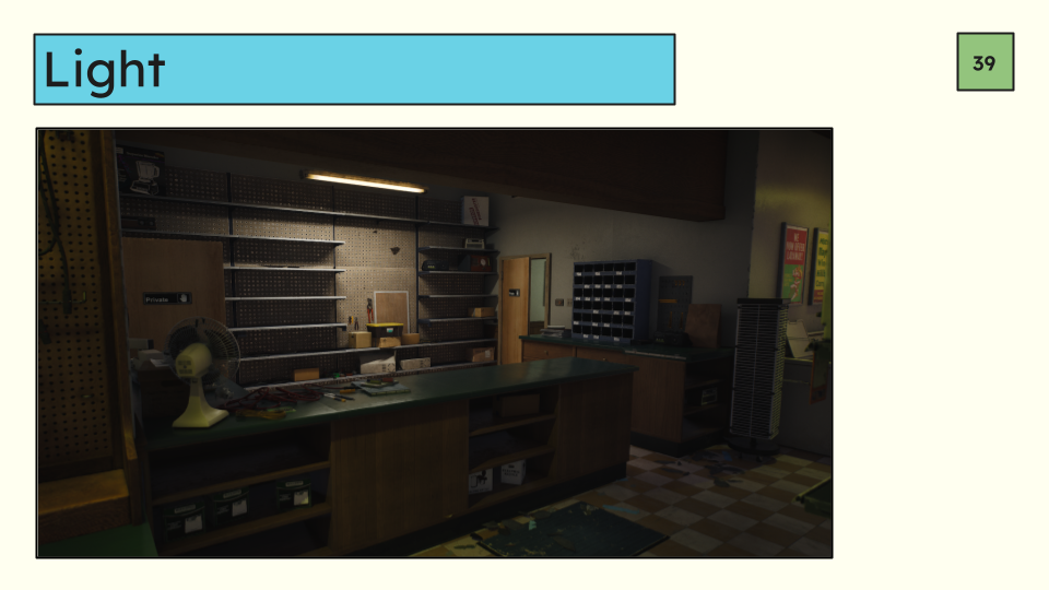
You can use lighting to do all kinds of things like highlight navigable elements like doors, windows, ladders, etc in the same way the container is highlighted in this image. In a multiplayer game the light can signal to the player that a person could be in a specific location particularly in large open spaces like outside where there are lots of places to look. In general lights are a great way to get the player to look at something very specifically. They’re a little bit of a silver bullet.
Of course, we most likely can’t do this for literally every important object and portal for performance reason. Depending on what you’re highlighting you could end up with dozens of overlapping lighting. Remember the “collect bleach bottles for your uncle” example from earlier? It would be kind of bananas to try and literally spotlight every bleach bottle in the room. It probably wouldn’t perform well, but it would also look super strange.
So, while we can use lights in this way, we still need to use the other fundamentals we’ve been talking about the whole time. It’s all a push and pull.
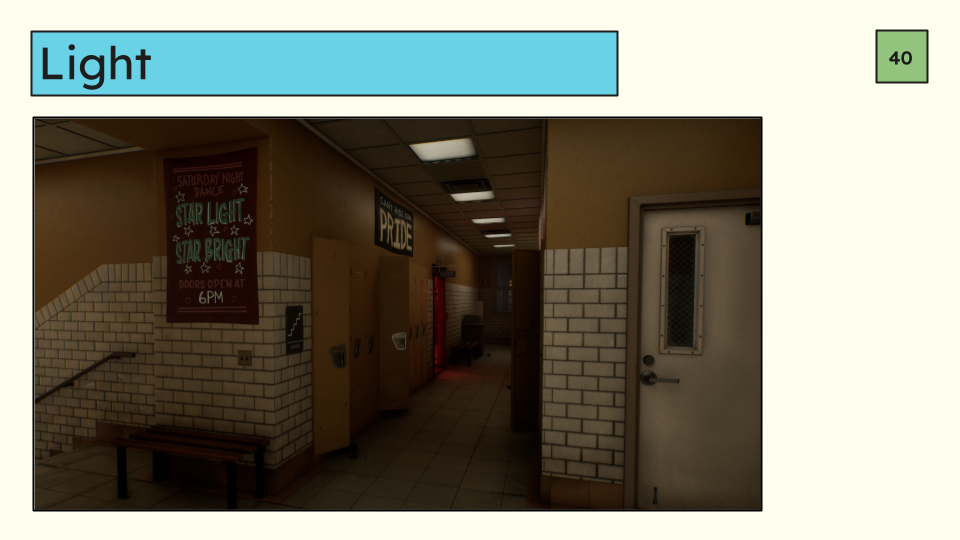
Moving on, We can use lights to split spaces.
In tight, or very large spaces it can be easy to miss a doorway to another room so to it make a quicker read, if that’s what your game needs you can use the light to highlight that there is a space there. You’re not highlighting the door itself like highlighting the container very specifically in the previous example, but rather the space beyond. I’m sure you’ve seen this example in a horror game somewhere-- a red light to tell the player to check out whatever spooky thing is just one room away. Where the red light spills out of the room.
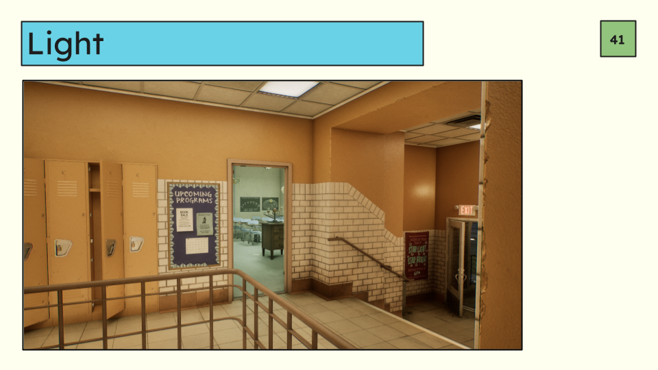
It can be much subtler than that too, where the main goal is simply to say “this space is different than that space” which is something you see frequently in multiplayer games in particular where the environment art is similar room to room. We talked about this a little bit with separating wall colors between rooms to create contrast through doorways.
This is an alternate or additional way you can do the same thing. In this example we’ve left the hallway very warm, but changed the classroom to be a cooler blue-green fluorescent light to help separate two space that have lots of white in them.
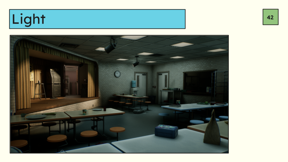
You can even do this within the same room. This is particularly helpful in really big rooms.
Really big rooms have lots of space that can blend together and you may want to help the player by “zoning” the room. It can help the player see a step up or down in a space to make it less unexpected, it can create depth and layers in a room that otherwise might not have them naturally which helps with navigation, and from a visual perspective it can just make the space more interesting.
In this example we have the cooler dim cafeteria and the warm stage which could signify a narrative, but also could just be saying “there’s a ledge here”.
We also get to see a few other separation methods we’ve already mentioned. The pink dressing room in the back is separated by color, and the absence of light in the kitchen is also a way to highlight a space because it creates a very dark in value shape on the wall.
When we put everything together we can accommodate lots of different types of gameplay without really changing the scene dramatically. Let’s take a look at one more example where we put all of this together.
First, what are our gameplay goals? Let’s do a multiplayer game because these often have some of the most limitations.
Its multiplayer
The character needs to climb over ledges and partial walls
There are also multiple lootable objects in the room
We need to be able to see doors and windows well to find players
The noise level needs to be relatively low, but we’re not necessarily on a shoestring budget.
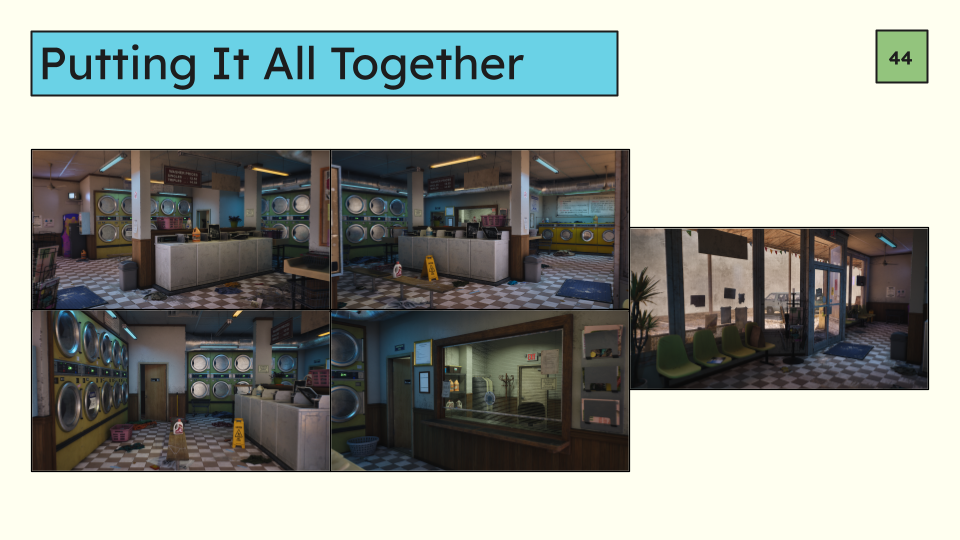
This is where we are starting—a quick thank you to Dekogon for their awesome asset packs and demo scenes I have been using for this. Absolutely no shade to these packs whatsoever, they are great and extremely useful.
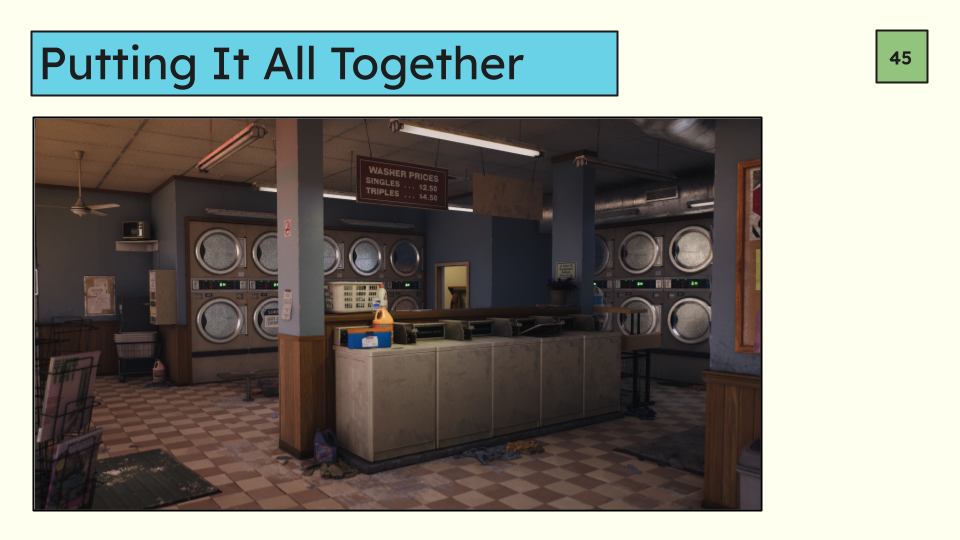
After quite a few changes we have landed here. Unlike previous examples the whole room has been updated so we can look at it as if we are players, from all angles.
Starting with our favorite angle we’ve dramatically reduced the number of colors in the scene to a blue/yellowy orange palette. The highest level of color is concentrated on the container at front and center and I’ve left one of the orange prop bottles bright as well to help grab your attention.
The lights have been moved around so that the light is highlighting the loot container.
In general we’ve also modulated our values around the whole room to separate the walls, floor, and ceiling. To aid in mental space mapping.
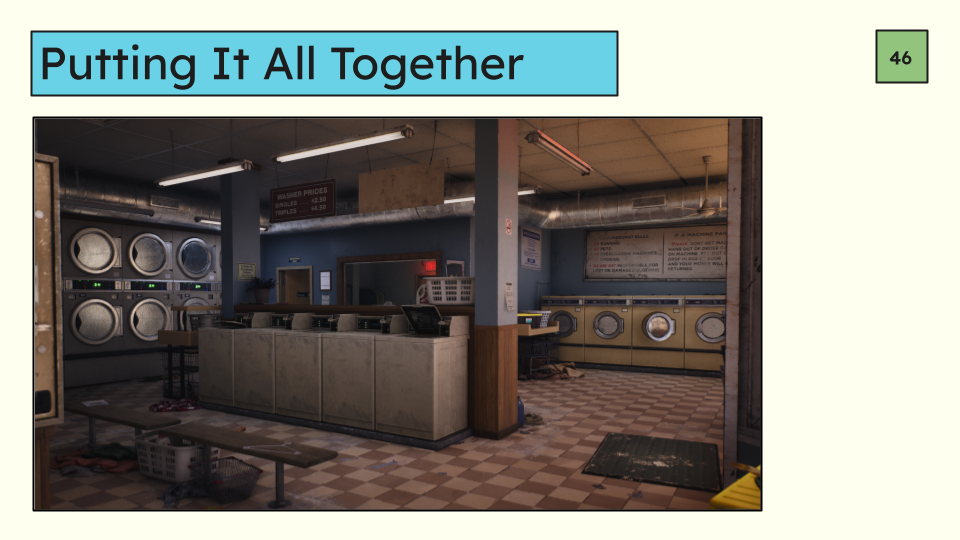
On the other side of the wall we can see the exit in the office highlighted with an exit sign, the door to the office is highlighted with a soft light, and the washers in the middle are softly highlighted with light to divide the space from the walkway on the other side of the washers.
We’ve also lowered the value on most of the wall signage so that its not grabbing your attention as much.
In general all values in the scene have been arranged into groups to simplify the reads and prioritize specific objects. For example, despite being different colors the washers in the back left and right are both a similar unlit value to the wall which puts them in the same visual “wall group” and they read together to some degree even though the colors are different.
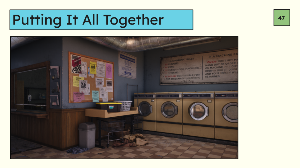
Zooming in on that yellow top container in the back we’ve left the set dress noise and color around it to call attention to a lootable item.
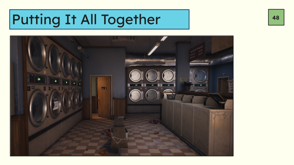
Looking towards the hallway we’ve declared the hallway separate with a warm light color, and you can see a sliver of the room behind it, a deep blue, so that space is separated as well.
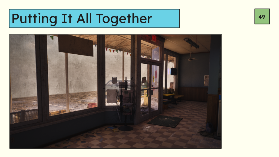
By the window we’ve deleted some chairs to accommodate a hypothetical design request to allow players to jump and bust through the windows. We also moved a bunch of papers taped to the window to a different non-bustable window. On the floor some debris gathered by the window helps denote the gameplay intention here. That noisy element calls attention to itself because its an outlier in noise volume. The only sign in the window sits above the playspace height so it can stay there because it won’t impede the player at all, its purely cosmetic.
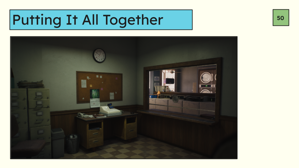
Going into the office, the counter is clear to allow players to jump over it and bust through the window with a clear landing zone in front of the desk.
The cash register is highlighted with some light and also sits at a slightly brighter value overall which makes it stand out more even though its not literally highlighted.
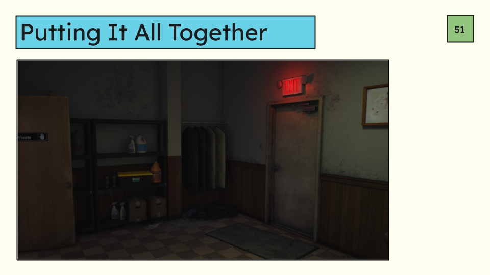
This corner is a little darker and we couldn’t add a light for performance reasons, there are too many overlapping lights.
To compensate we’ve concentrated some detail around the lootable object and also increased the saturation and value of the lid. You may have noticed all lootable items got that increased saturation treatment regardless of where they were in the scene to make sure that they are outliers to the average saturation thus drawing attention.
At the end of the day there is no wrong answer when tailoring your worlds to gameplay. It entirely depends on the needs of the project you are working on. Its all very relative, but whatever you do it must be intentional. Making these intentional, directed, choices are one of the things that separate artists from developers. Artists make beautiful art but developers make beautiful games.
Thank you!